
The visual display of information is meant to enhance our understanding of reality, to present facts so that we can complete a picture or answer a question. Often times however, such displays can be more misleading than informative.
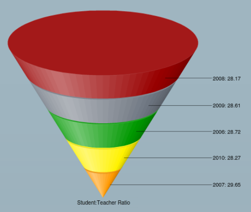
3D funnels like this image encapsulate this problem.
Without looking at the numbers, take a minute to guess which one is largest. This chart gives us no useful information: it’s difficult to determine which section of the graph is largest and the scale of the image produces a limited view of the data. A chart such as this wastes time and disguises important insights.
By putting the same information into a bar chart, we can more clearly see which years had the highest and lowest ratios. The red one (2008), with the most amount of screen real estate, was actually the lowest!
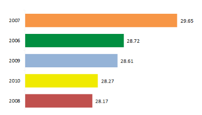
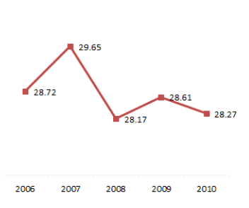
Although the bar graph is more informative than the 3D funnel, the use of color is distracting and we’re still only looking at a list of information rather than an analysis of the data. If we put the same information into a line graph, we can now compare not only the student:teacher ratio from year to year, but can also see the context that would allow us to perform a longitudinal analysis. Judicious use of color and space have created a richer display of crucial data.
So, to sum up, the best dashboards are those that:
Avoid 3D
Use color judiciously
Don’t shy away from data density
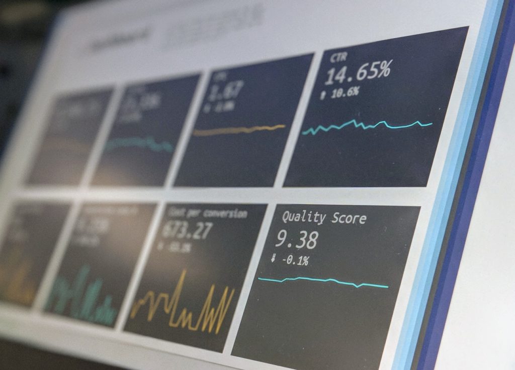
These dense and meaningful representations of data can be easily created with existing Microsoft technologies (Excel, SQL Server, and others). Your institution likely has these tools at its disposal, meaning that you can improve dashboards without investing in new products.
While these dashboards are easy enough to create with such tools, their usefulness depends on the data model on the backend. We’ve worked for almost ten years with colleges helping these institutions to monitor the success of intervention programs and enhance student outcomes.
By bringing together multiple data sources and making them immediately accessible to end users, ZogoTech’s data warehouse enables executives, institutional researchers, and student services personnel to monitor strategic goals and perform longitudinal analyses. The institution is able to become more data-driven over time as more people are able to conveniently access the information needed to make decisions.
For more information on this topic, watch our webinar, “Best practices in Dashboard Design”
Learn more about what ZogoTech can do for your Institutional Research and Student Services departments, and contact us to set up a demo.
